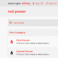
Red Power Theme
Lightly designed theme. Simple and fast.
Change Log for Red Power Theme
Version 2.0 stable Build #7
RESPONSIVE, YES. But only for the INDEX and SHOWTHREAD pages. Not for the USER AND MOD CP, yet.
It may be pretty much unusable right now as I didn't do anything about NEWTHREAD. I guess you can delete the content of responsive.css.
And it's only for phones. Who uses tablets anyway? They're just big phones.
Called it 2.0 because I drastically changed how the theme looks, I removed the eye straining red solid borders which was originally meant to be the identity of the theme. Now it looks much more light, less red. You will notice the changes in showthread.
Yeah I know it's a straightforward header but not necessarily a bad one. I will work on that.
Version 1.3 stable Build #6
- Updated templates for 1.8.24.
- Some padding/margining changes throughout the theme.
- No longer forcing vertical postbit, giving a usable horizontal postbit and proper postbit buttons.
Version 1.2.1 stable Build #5
Added some missing stylesheets which caused quicklogin popup to glitch.
Version 1.2 stable Build #4
Improved coloring throughout the theme.
Version 1.1 stable Build #3
- A build for a more polished look and improved coloring choices throughout the theme, though still uncomplete.
- Clearer postbit, vertical only.
- Dropping Turkish language support from now on.
- Planning to design a "dark mode" for this theme, and possible responsiveness.
Version 1.0.2 stable Build #2
- Updated translations.
- Fixed 1 bug for English translation.
Version 1.0.1 stable Build #1
The first build has no changes.
